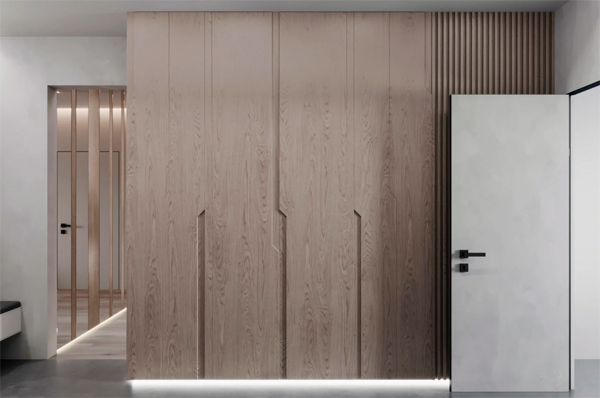
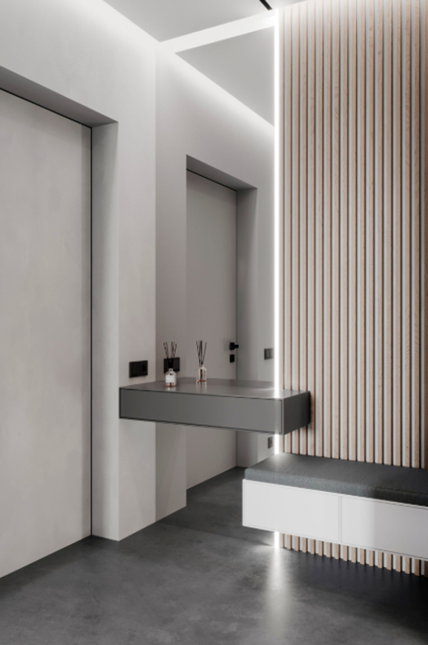
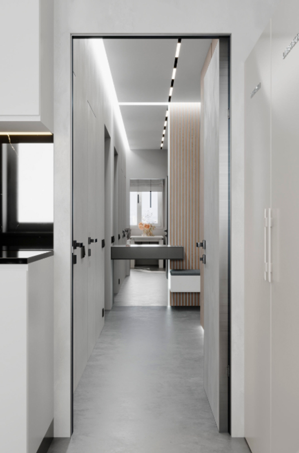
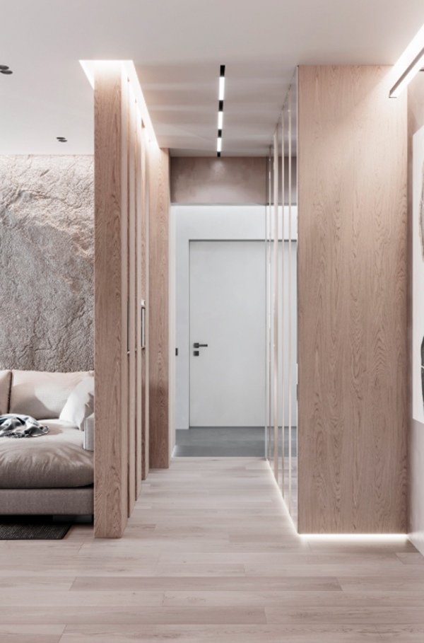
Futuristic touch of the game lighting contrasts with a minimalist interior style. This project is particularly interesting because the apartment is located in a panel house, so that the construction and renovation is to a minimum. Designed by AE Architects, Park Peredelkino Middle is an apartment owned by a young couple with children. Instead of having to build a wall, the partition between the corridor and the living room is replaced by a vertical module that functions as storage. Ceiling height are small, only 2.7 meters determine the basic concept of this interior. Vertical lines that appear in the hallway are visible even throughout the apartment to the private sleeping area. Most use natural materials in warm colors with different textures to make the interior look expressive and make the occupants comfortable.
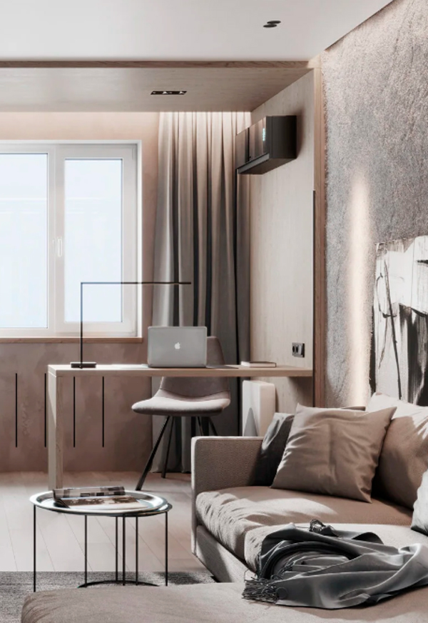
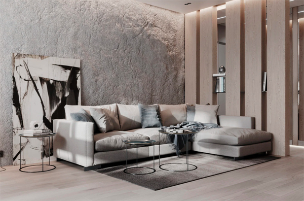
An interesting and smart combination of a living room integrated with a home office, located inside an 85 square meter apartment in Moscow. Soft colors are seen in the use of sofas and wood elements in furniture selection.
Warm nuance is obtained thanks to the large wooden panel that welcomes in front of the main door. The lighting game emphasizes the modern impression of the additional lighting that we can see in every part of the apartment.
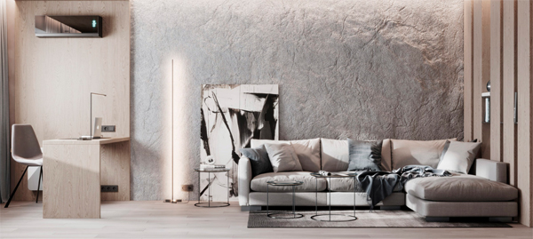
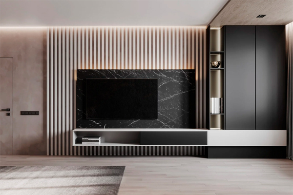
This is the room that is the center of this apartment. Corner sofa, home office and a TV unit be balanced between personal life, work and entertainment.
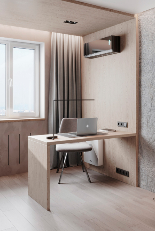
To distinguish between other spaces without a partition wall, home office using touch wood that wraps almost every part. Also equipped with air conditioning to maintain comfort and remain productive even though working from home.
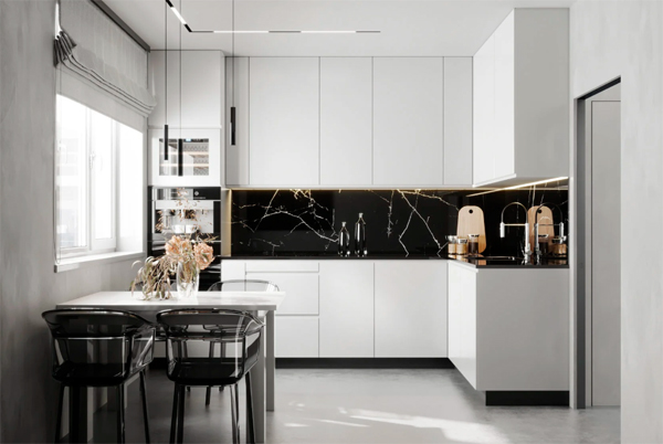
The kitchen is kept to a minimum with white tones and dramatic touches. Luxurious impression seen from the selection of marble backsplashes walls that contrast with the base color.
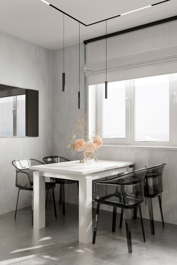
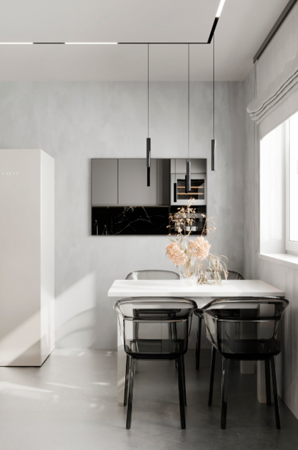
The dining room also looks minimalist but still cozy and bright as the ideal placement. Located near a large window that allows natural light to enter. The mirror is also very helpful to create a broad impression of the actual size.
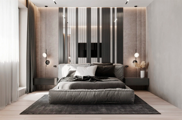
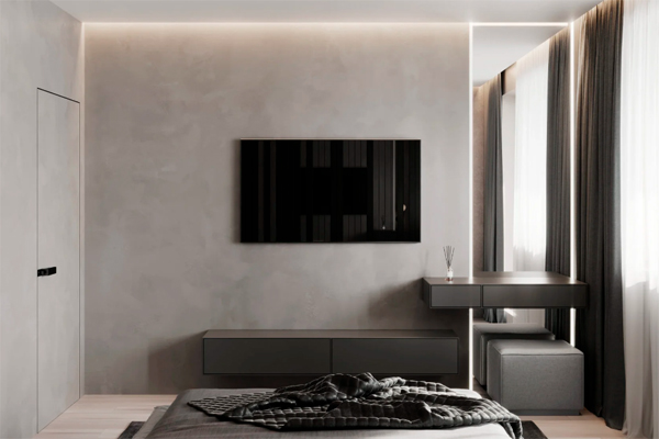
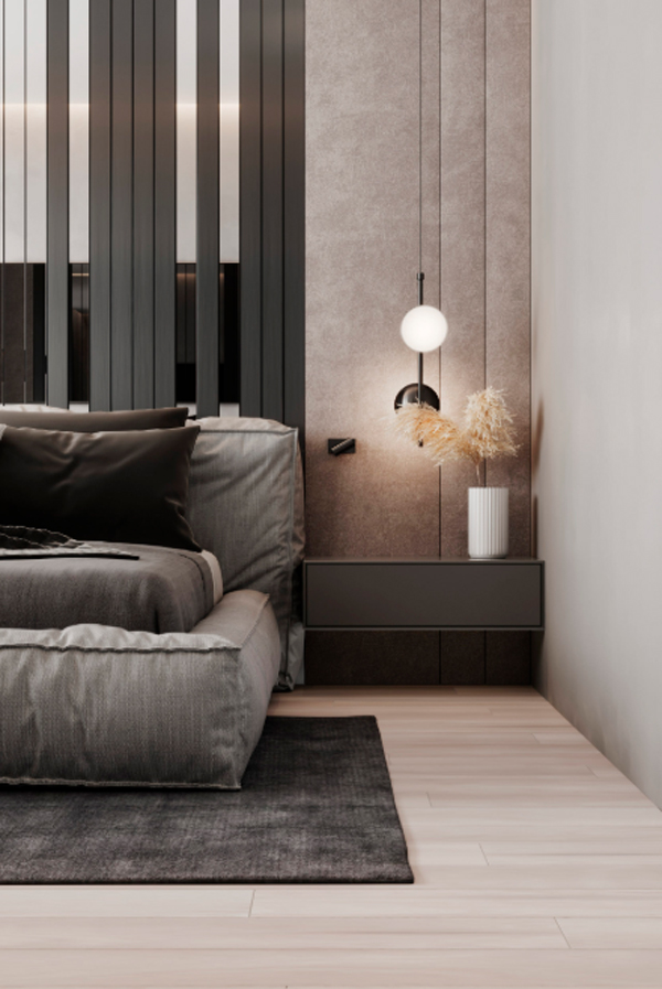
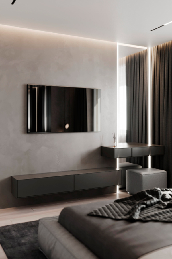
The main bedroom feels more masculine but still warm. TV unit mounted on the wall of the room as a medium of entertainment throughout the night.
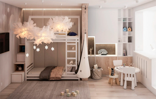
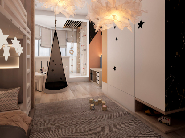
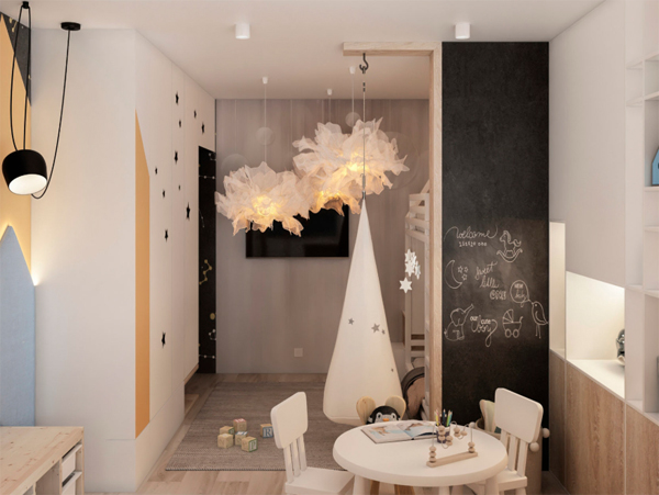
Kids bedroom is no less gaining attention. Scandinavian touch is very thick here because of the choice of furniture and natural touches of wood. There is a playroom, storage wall, swing to the bedroom level with a unique storage ladder.
Fused with a bedroom, playroom has its own study desk, chalkboard walls and warm lights shaped cloud hovering.
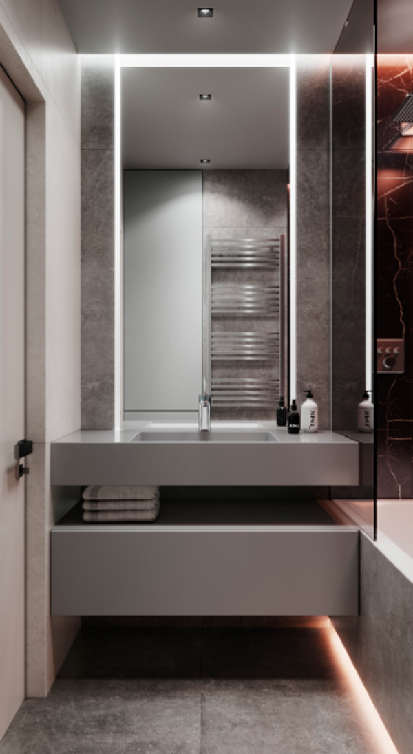
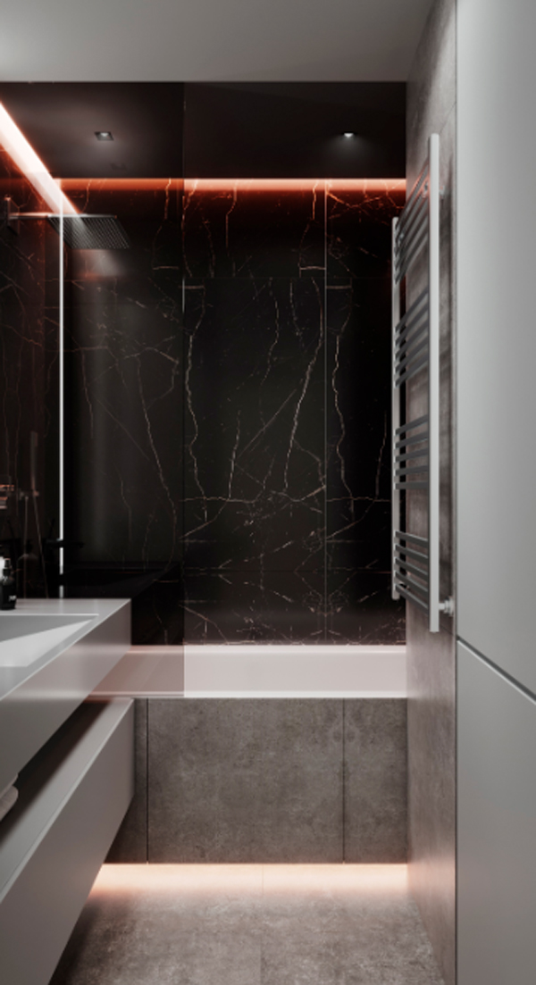
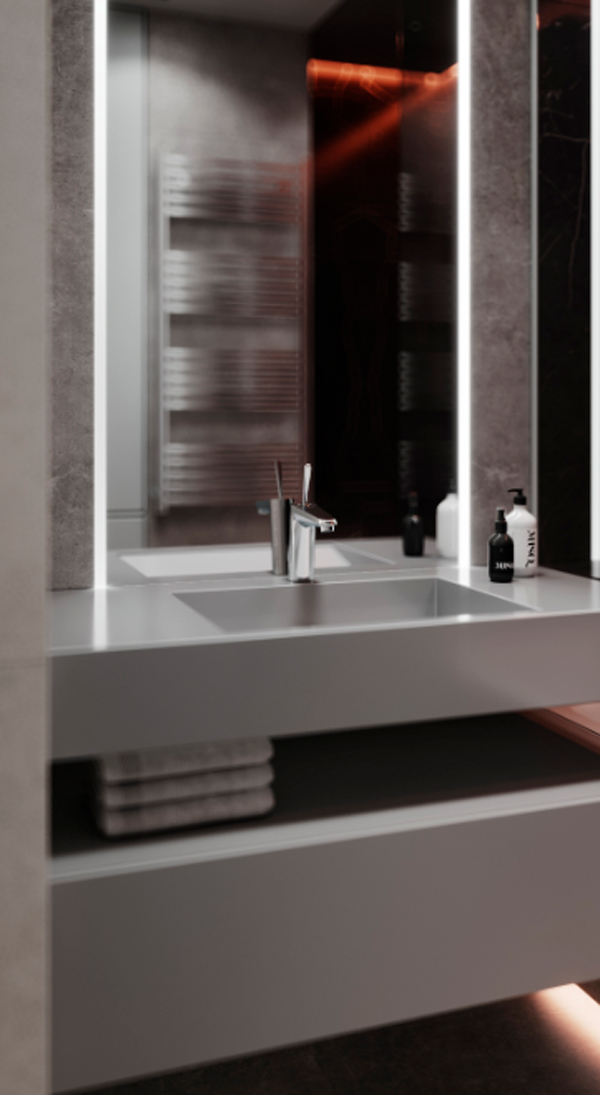
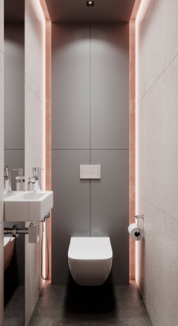
The small bathroom really doesn’t feel cramped. Still using touch lighting as an attractive design line. Each section is used for convenience and ease of access the all that is needed as storage shelves and cupboards hidden in the bottom of the sink.
Bathroom mirror also has lighting around the mirror. Make bath time more enjoyable.




Reply