Raven House is a revival of a stunning old house. Located on Mayne Island and renovated by Measured Architecture. It is also a story of mediation while retaining the original build and the client’s desire to adapt in a way that suits their personality. Of course, this project was a challenge for the architect which ended happily.
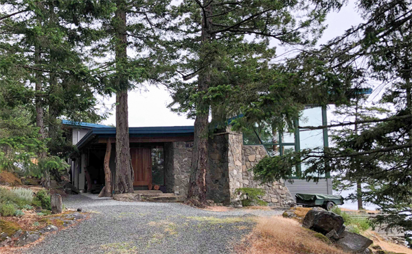
Raven House original plan
Starting from a resting place that is on the bow of one of the highest points on Mayne Island. This is the original building which was architecturally completed by Blue Sky Architects, and wanted to be renovated according to the client’s wishes. Its main purpose is to protect the critical bone of the building and work to graft a contemporary simplification of inherited geometry. The client had the budget carved in stone at first. But in the end, as these designs traveled together and a strong bond of trust was formed, they eventually chose to develop it and the results were worth it.
Concept that blends with nature
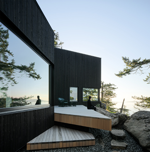
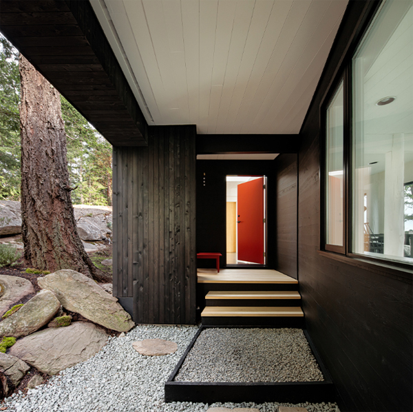
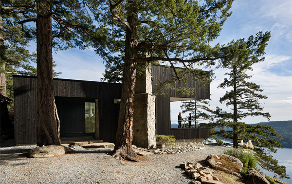
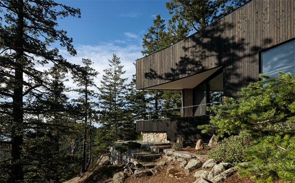
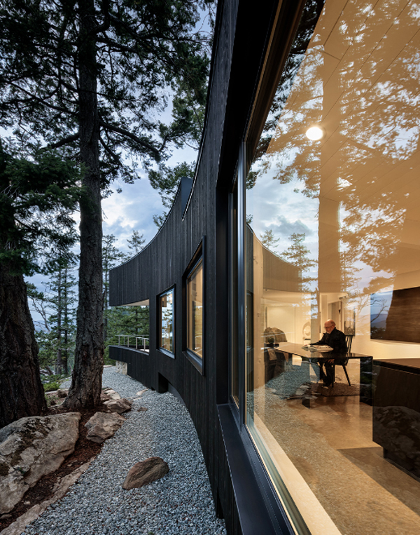
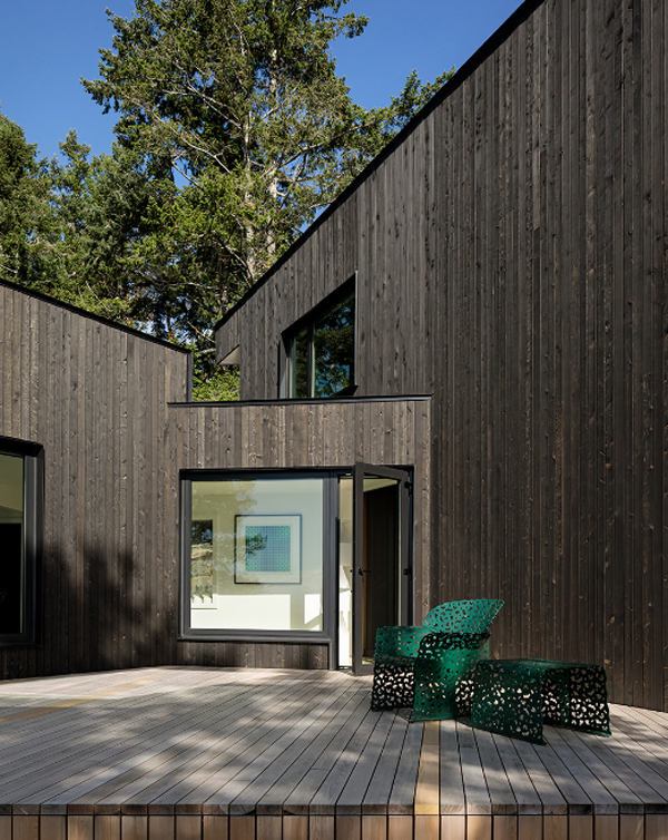
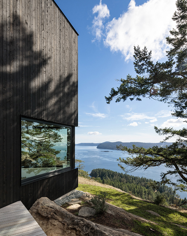
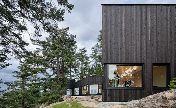
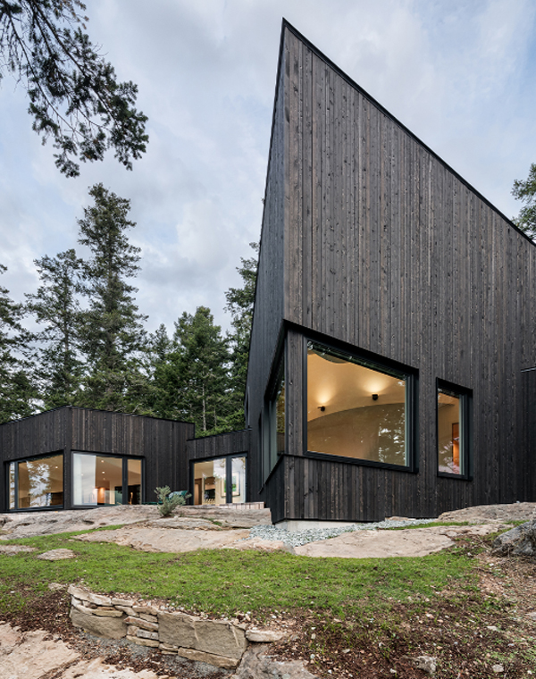
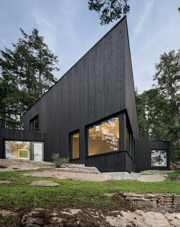
The concept of this project is how to interact with nature as much as possible but without destroying or touching nature. The solution was to use the existing structure to work as scaffolding for the building’s new veil, the subdued black faade featuring the swooping roofline on the outside. The architects also chose to tame the expansive view through the window frames, reducing the size of the windows to keep the scale of the building more humanistic.
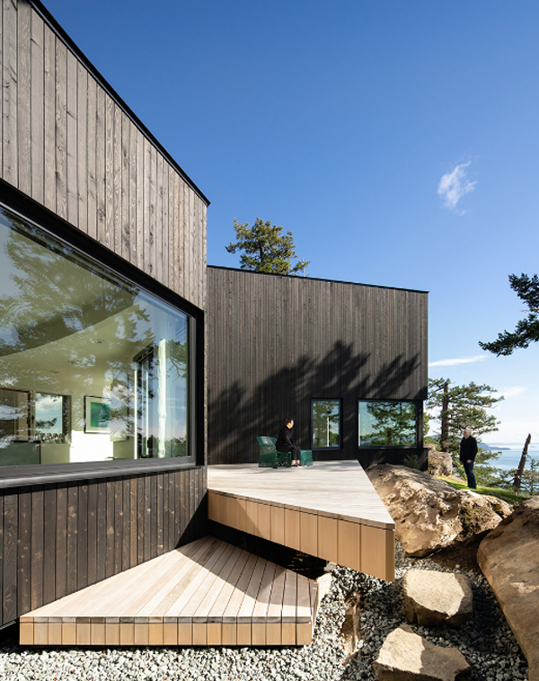
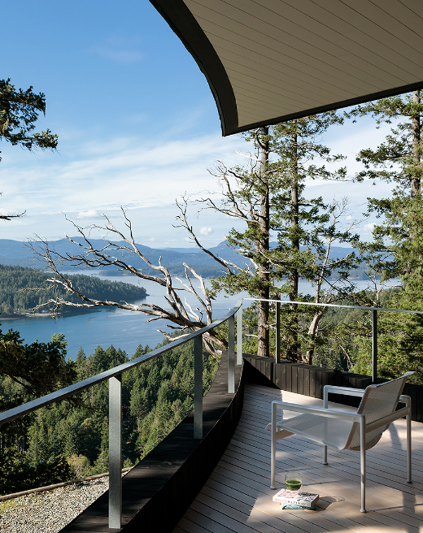
Because of its location at an altitude, the house must really be more weather-resistant. Perched on top of a 500-foot cliff, the wind and green constantly crash against the structure. However, the architects were able to put our extensive environmental and window expertise to good use, bringing the science of the current envelope to the project to help create a greater interface between the natural environment and the house within. Initially this house did not have a deck, so an outdoor seating area was added to the front half of the building, which inspired the name Raven House.
Interiors
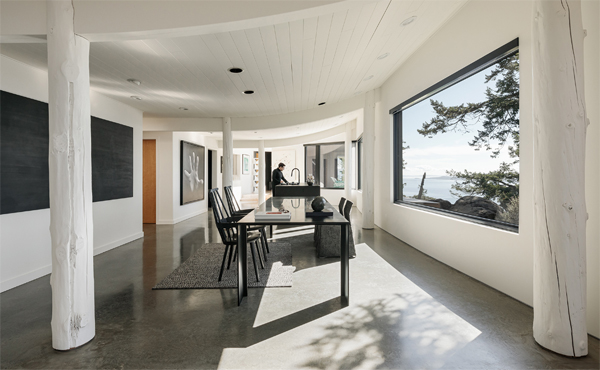
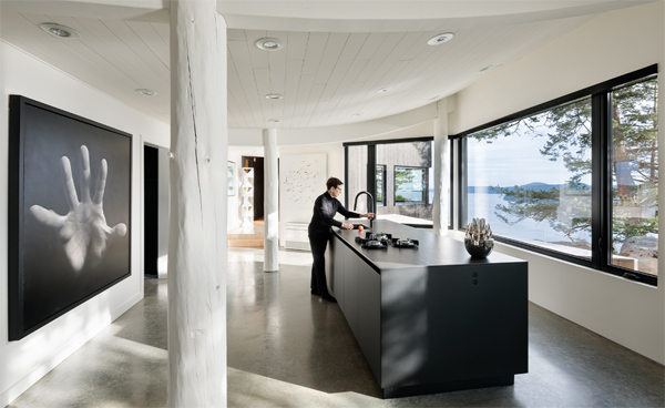
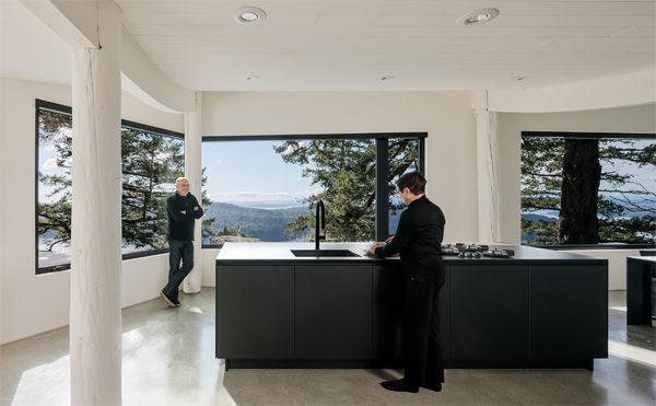
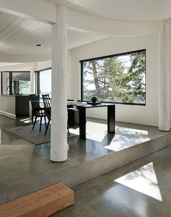
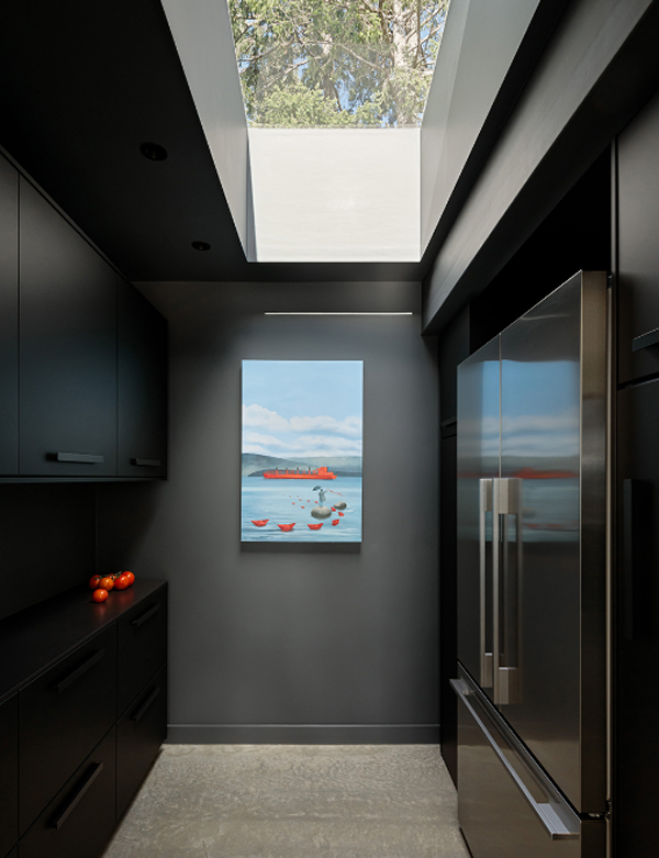
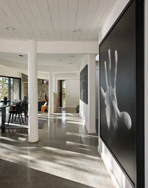
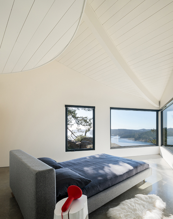
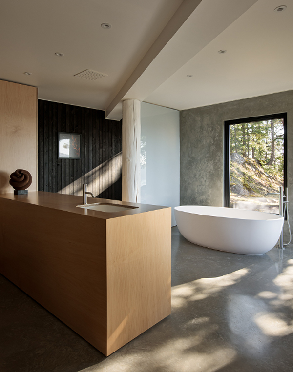
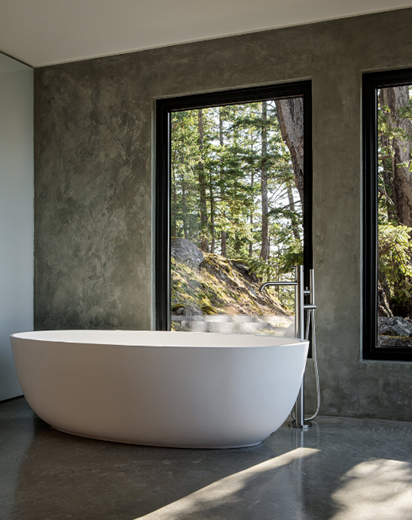
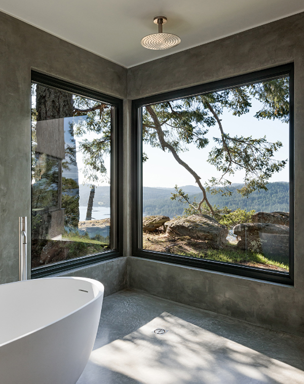
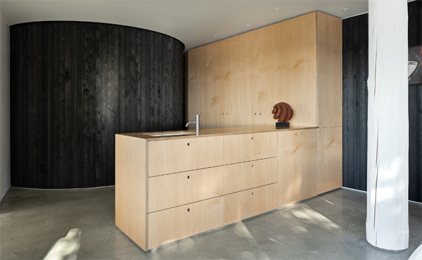
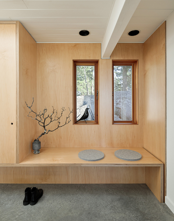
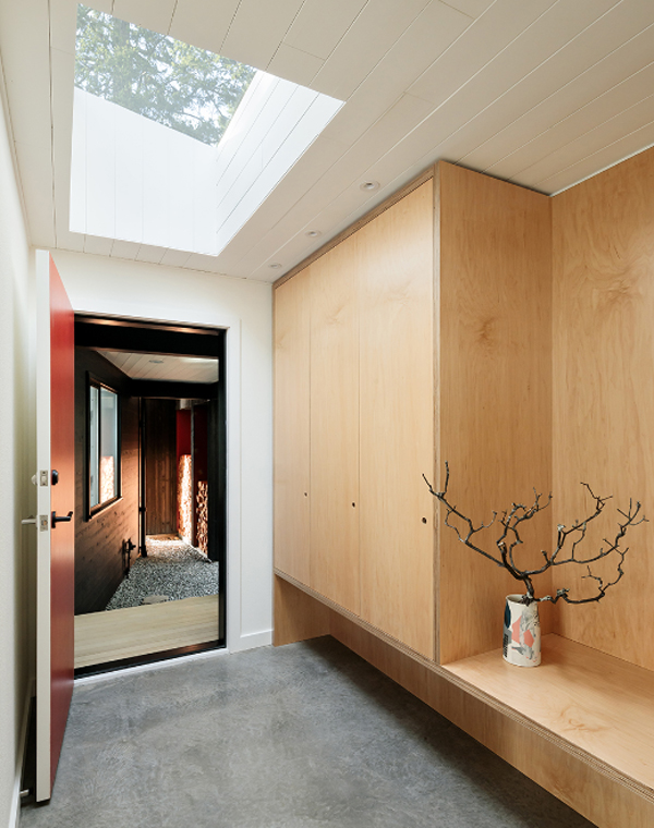
Being inside, simple interior arrangement with a focus on specific spaces to save budget. The traces of the building are maintained and work to maintain an understated language inside. That means neutralizing the yellow cedar of the original interior through a white and gray palette. Walls, stripped wood columns, and a badly stained soffit painted white, while cast concrete was chosen for the floor. The kitchen and master bedroom have also undergone an overhaul, including an en suite bathroom with a stunning concept. It is a built-in maple plywood with an open standing shower like a wet room and has a free standing tub, the entire space is framed by exposed walls for spectacular views.
photography: Ema Peter Photography
architects: Measured Architecture




Reply